A love song so divine
by Francis McKee
Commissioned for the exhibition Love and odd posters at The Model, Sligo (2022)
The title of the exhibition immediately swings from a grand theme (‘Love’) to untidy details (‘odd posters’): it suggests an experience that may be playful, potentially mischievous, seductively chaotic. The layout of the exhibition itself asks questions of the artist, the visitors and a cast of collaborators that will populate a workshop that straddles both a space for making and an exhibit in its own right.
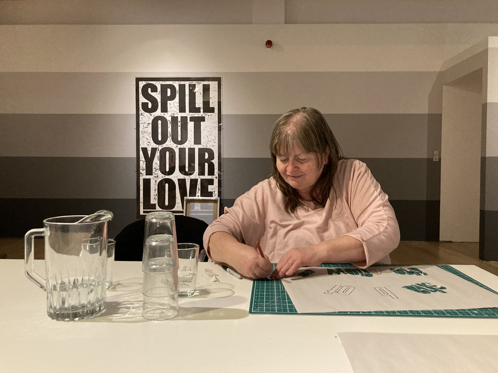
In the East Gallery of The Model, Phillips has established Workshop, an active printing studio where three different local groups work create works over the course of the exhibition. It is an experiment, as all collaborations are, with the artist dipping in and out of the making process while the groups also work with each other to develop new prints. The completed pieces may or may not be presented in the space but it’s clear that the active process of making is also on display for the public who can interact with the various participants. At that point, it also becomes moot whether the exhibition visitors themselves have become part of the piece as they engage with it.

Workshop, 2022
With Cranmore Community Co-operative
Commissioned by The Model, Sligo
Photo: Ciara Phillips
Phillips’ Workshop feeds on the energy and vision of Corita’s studio and teaching practice. Workshop sets up a public encounter with collaborators where the outcomes are unknown and the process is a form of artistic and political interaction. In such a collaborative space the dynamics of power are always fluid – between the participants in their groups, between the groups and Phillips herself. Discussing an earlier iteration of the project in Stavanger, she says:
Works developed through Workshop are the product of many people and so it’s not possible to say … what the things we make will be or how they should be presented. But there will be an accumulating of information taking place within the gallery ... I always keep a note of what’s being discussed in collaborative situations and some of those notes will gradually be added to the walls of the gallery as the project progresses. The note-taking helps me to remember what has been said and it also lets others have access to what’s being talked about and what’s informing the collaboration.3
This is broader than the current vogue for collective art practices. Workshop displaces the artist in many ways, it challenges the issue of hierarchy in exhibition selection and it focuses on the development of relationships through creativity over time. Perhaps this is where the larger theme of the title begins to emerge. To mention love in an increasingly cynical and desperate world can cause confusion. The immediate assumption might be to take the suggestion ironically or to consider it safely from a calculated intellectual distance. But what if it could be taken sincerely as a generous, open, acknowledgement of the failures, differences, strengths and positions of others? A stance where mutuality, care and affection inform all activities without sentimental clichés or overly utopian visions of perpetual harmony. This could generate a space where ideas can be tested and challenged as people grow together through creative work. One account of Corita’s pedagogical approach hints at such an arena:
The art department at Immaculate Heart is a place full of questions, a place whose only answer is really an attitude of openness to and celebration of life. It is part of Sister Corita’s teaching method to keep her students constantly struggling with the kind of questions that make them open up to all their experience, sifting it for possible answers. Students live with such questions as “What is a revolution?” “How are food and peace related?”4
Ciara Phillips generates her own space in Workshop though rather than populate it simply with questions it’s possible to see the titles of her own prints as provocations that lead viewers to ask questions of the relationship between text and image and the operation of the works they are exploring. Recalling the emblem books of the sixteenth and seventeenth centuries where a picture is juxtaposed with a text in a puzzling conjunction, Phillips attaches titles to prints that lead us into interpretive labyrinths. Along the way we discover echoes, potential clusters of meaning, intriguing relationships or disjunctures between works and the titles ascribed to them. Discussing the use of titles in this exhibition she has explained that they are partly inspired by a Tove Jansson short story in which a new cartoonist takes over a celebrated strip and explores the previous artist’s office - 'Odd posters' is part of the description of the cartoonist's office as he finds it, "The walls were covered with old calendars, clippings, ads, odd posters, announcements, clumps of paper, all held in place by thumbtacks. The room gave an impression of a life that had passed long ago and been forgotten, a life no one had had time to tidy away.”5 As life after Covid lockdowns assumed some aspect of normality Phillips found that image resonant:
The titles for my works have come from thinking about my own studio in this way and what it was like to return to it after 18 months away during the pandemic. It is a bit like the ghost of exhibitions past, but not just that. The titles are part descriptive, and partly about the thought space of the studio captured in notes that I've kept on my phone. They started off as a more descriptive walk-through, and then I chopped them up to remove the narrative aspect. I worked on the sequence of them first and then just let them 'fall where they fall' in relation to the layout of the works in the gallery.6
Within this randomized sequencing it’s still possible to catch glimpses of Phillips’ return to the studio and that odd sensation of simultaneously recognising the pre-pandemic world and acknowledging its distance in the past. There are ‘Ghosts’ lurking in the works and fragments of detail – ‘Colour got it right the first time’, ‘Foamboard model of a Norwegian gallery’ or ‘Dirty plexi and a broom’. At the same moment there are what may be real time observations – ‘Idling buses’ or ‘Gentle knock on a partially open door’. Equally, internal conversations echo across titles such as ‘Price is not a subject’ and ‘Forgiveness could be’. And if Workshop raises questions about collectivity and non-hierarchical forms of working together then titles such as ‘Pay someone to tell you what to do’, ‘Structure organised by the employees’ and ‘Boss-less’ carry those thoughts through to the prints.
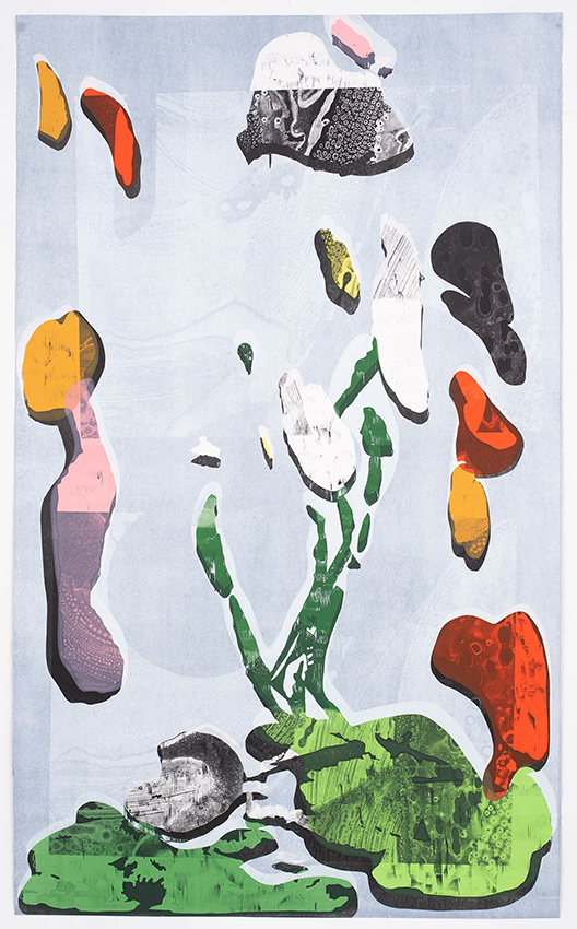
Colour got it right the first time, 2020
Photo: Daniel Persson
None of this is dogmatic, nor does it construct a system of clear meanings that can be deciphered. It is open-ended and improvisational, allowing chance to play a role in the building of meanings, inviting viewers to play with the images and exercise their own interpretive skills, bringing their own life experiences to their readings of the work. The print as a medium encourages this approach and it’s something Phillips recognised early in her practice:
At a certain point I realized that I could make prints however I wanted and that I could involve other people into the process - that made it feel exciting. And as a medium I like the level of uncertainty that comes from printing - the tools and methods often interfere with my intention, and I find that quite productive. Something happens that wasn’t entirely planned and then I have to reassess. The work is the product of improvisation - a back and forth live discussion with the work as it happens.7
The improvisation is a response to the dynamic qualities of the materials and processes of the medium. The interference Phillips refers to is something that can impact on the meaning and interpretation of the work. Hence perhaps the differing versions of prints that appear in the exhibition. The series including ‘Colour got it right the first time’, ‘Turns to dust when you touch it’, ‘Price is not a subject’, ‘Forgiveness could be’, and ‘Hope in looseness’, all turn around a roughly similar pattern but the changes and versioning alter their impact (reflected too in their titles). Relativity plays a major role in the perception of all of the prints. ‘Looped lock’ and ‘Everything at face value’ move between photographic positive and negative; ‘Oversized sweatshirts….’, ‘Pay someone to tell you what to do’ and ‘Boss-less’ are shredded like paper or pasta while transformed with the addition of tails of bright red.
The role of colour, in fact, is primary to the impact of these works. They are made knowingly, with a full awareness of the legacies of Pop Art, Warhol and Corita Kent, all of whom felt the scorn of art critics for their love of colour. The Scottish artist, David Batchelor, facing similar resistance to his use of vibrant electric hues found himself writing a small treatise – Chromapobia (2000) – in which he argues that there is a long history of opposition to colour:
Chromophobia manifests itself in the many and varied attempts to purge colour from culture, to devalue colour, to diminish its significance, to deny its complexity. More specifically: this purging of colour is usually accomplished in one of two ways. In the first, colour is made out to be the property of some ‘foreign’ body – usually the feminine, the oriental, the primitive, the infantile, the vulgar, the queer or the pathological. In the second, colour is relegated to the realm of the superficial, the supplementary, the inessential or the cosmetic. In one, colour is regarded as alien and therefore dangerous; in the other, it is perceived merely as a secondary quality of experience, and thus unworthy of serious consideration. Colour is dangerous, or it is trivial, or it is both. (It is typical of prejudices to conflate the sinister and the superficial.) Either way, colour is routinely excluded from the higher concerns of the Mind. It is other to the higher values of Western culture. Or perhaps culture is other to the higher values of colour. Or colour is the corruption of culture.8
Ciara Phillips is aware of the power of colour and of the suspicion that surrounds it. In particular, her work plays on the subversive qualities of colour in her prints. It can be unruly and disruptive and it is, simply by its blatant presence, a form of protest acknowledging ‘the feminine, the oriental, the primitive, the infantile, the vulgar, the queer or the pathological’. It is driven too by humour and a determination to move away from the seriousness or cosiness often ascribed to ‘craft’. In this exhibition the space itself might refer back to the studio of Corita Kent and the Factory of Andy Warhol, but it very much digs into the present and situates Phillips’ own practice in a world that is digital and material. Even some of the walls have morphed into a shocking virtual blue, pulling us into an immersive environment where circuit diagrams guide us through the innards of a gallery transformed into a vast print machine. The two prints titled ‘Ghost resting on soft blocks’ toy with the print as gallery map while looking into the future beyond the exhibition where those maps become rare traces of an event that passes through an art space.
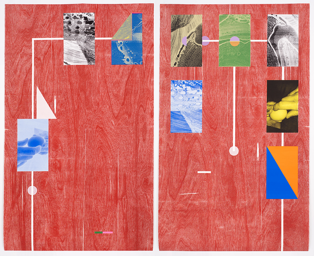
Ghost resting on soft blocks, 2020
Photo: Daniel Persson
The poet Lisa Robertson helps us see the temptations of colour that we, like Corita and Ciara, cannot resist:
Repeatedly we have attempted to define colour for ourselves, although it is only with great difficulty that we depart from the sultry glamour of pigment. Between mysticism and glamour, we would rather not choose.
We could say juice, or pigment, to indicate that aspect of substance that travels across. Such juice is always psychotropic. It translates mentalities. We might say that pigment is that motion spontaneously produced by substance in conjunction with light. Dangerously pigment smears. Artifice is the disrespect of the propriety of borders. Emotion results. The potent surface leans into dissolution and disrupts volition—it’s not a secluding membrane or limit. To experience change, we submit ourselves to the affective potential of the surface. This is the pharmakon: an indiscrete threshold where our bodies exchange information with an environment.9
Vitally, Robertson highlights the ways in which colour spills across boundaries, encourages strange new unities and disrespects ‘the propriety of borders’. Colour leads to change. Phillips’ use of colour underpins an art practice that opens the artist to other people and other element – the practitioners in Workshop, viewers in the exhibition, the chance events in the printing process… Her colours emphasise the sensuality of material in their surface textures while the freewheeling democracy of her titles take us through a spectrum from physical sexiness to spiritual love, from ‘Is it sincere’ to ‘Let’s Just Love’.
Workshop, 2022
With Cranmore Community Co-operative
Commissioned by The Model, Sligo
Photo: Ciara Phillips
1 In The Philosophy of Andy Warhol: From A to B and Back Again (1975) he presents this simply through his love of Coca-Cola: “You can be watching TV and see Coca-Cola, and you know that the President drinks Coke, Liz Taylor drinks Coke, and just think, you can drink Coke, too. A Coke is a Coke and no amount of money can get you a better Coke than the one the bum on the corner is drinking. All the Cokes are the same and all the Cokes are good. Liz Taylor knows it, the President knows it, the bum knows it, and you know it."
2 In the wider context of the Immaculate High School it was clear that the institution was viewed as a threat by a more conservative Californian church hierarchy. A Wikipedia entry on the school notes that ‘In the late 1960s, in response to directives from Vatican II as well as participation in therapy experiments run by researchers from the Esalen Institute, the Sisters followed the guidance of Pope Paul VI and conducted an extensive review of their structure and proposed changes in how they prayed, worked, lived together and governed themselves. However, the Archbishop of Los Angeles, Cardinal James Francis McIntyre, was opposed to all of the sisters' proposed changes, leading to a public dispute where he ordered the removal of all Immaculate Heart Sisters teaching in Los Angeles diocesan schools, and finally presented the Community with an ultimatum: either conform to the standards of traditional religious life or seek dispensation from vows. In the end, 90% chose to dispense from their vows and reorganize as a nonprofit organization.’ https://en.wikipedia.org/wiki/Immaculate_Heart_College#cite_note-TIME1970-4
3 Astrid Helen Windingstad, ‘A Conversation with Ciara Phillips’, September 25, 2019, https://kunsthallstavanger.no/en/news/a-conversation-with-ciara-phillips
4 Sandy Cutuli, “From Sister Mary Corita and the Art Department of Immaculate Heart College”, Our Sunday Visitor, August 7, 1966.
5 Tove Jansson, ‘The Cartoonist’, in Art in Nature, translated by Thomas Teal, Sort of (2012).
6 Email correspondence with the author, March 25, 2022.
7 Astrid Helen Windingstad, 2019.
8 David Batchelor, Chromophobia, Reaktion Books, 2000.
9 Lisa Robertson, ‘How to Colour’, in Occasional Work and Seven Walks from the Office for Soft Architecture, Clear Cut Press, 2003. Robertson expounds further on the sensual and mutual effects of juice: “When we say juice, we mean a tinging juice, a juice which marks the surface through co-operation. Such a juice is to be found in the juice of ink, the red juice, things filled with a red juice, a concentrated juice. Armies run with juice. This juice has a property, this juice appears to be connected to phenomena. Pure red juices are common as are the juices with very rich and powerful hues. Something yields a beautiful yellow juice. Flowers and their juices are bleached by sulfur. The glamorous surface is nourished by perfect juices. When we want to produce something exciting, something alluring, we begin with pigment or juice.”